
SaRA Health
Industry
Health Care
Role
Lead Product Designer
Platform
Mobile
UX Disciplines
- Research
- Information Architecture
- Interaction Design
- Visual Design
Research Methodologies
- Semi-structured interviews
- User Journey Mapping
- Designing thinking workshops
- Survey
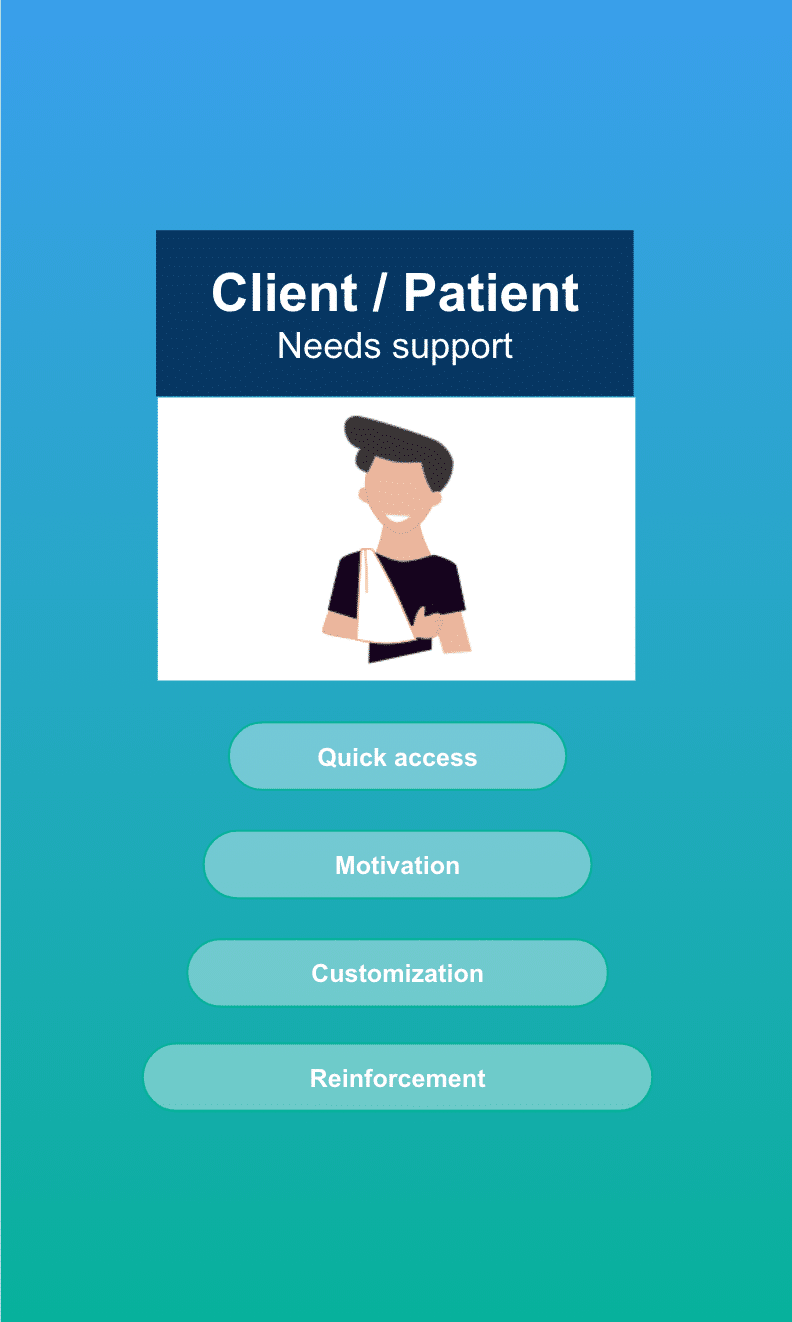
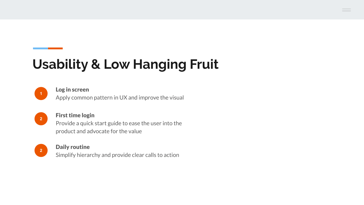
How might we reduce friction for first time users, physical therapy patients.
SaRA Health is a start-up with the mission of improving patient outcomes by simplifying the injury recovery process. If you’ve ever needed Physical Therapy from an injury or as you’ve recovered from surgery, than you know how hard it is to follow through with your recovery plan at home. This digital assistant allows your doctor to share custom videos and track your progress as you complete your movement homework.
During beta testing, the founders of SaRA got a consistent signal that although patients love the idea of the service, the SaRA app did not feel “easy to use”. During this project I lead an effort that investigated potential friction points in the first time user experience and address them from different angles including, on-boarding education, usability fixed, and perhaps most importantly, changes in workflow.
Impact & Goals
Patients were not using the product
The baseline metric for this project was user signups. Before we started this work, 100% of all users signup were facilitated “in-shop” by a care provider. Of course, this was not desirable long term.
- Increase # of sign-up
- Increase user awareness of features
- Increase # of completed routines
- Increase positive patient outcomes
")
")
")
Approach
It was important to properly contain this project as it had the potential to swell. As so, I recommended using a week long design sprint format to explore space. It worked particularly well as there was already a baseline knowledge and understanding of the problem that needed to be framed and validated. Once there was agreement on the scope and share of the problem space amongst the participating team, Product Leadership, Engineering, and myself, we moved on to the solution space.
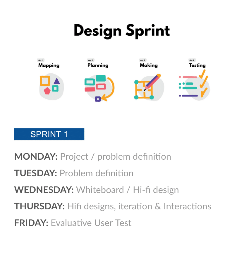
01
Mapping
Leveraging the following discovery formats I lead the team through the problem space. The team consisted of myself, the CTO, and CEO
Semi-structured interviews
As I was a newcomer on this project, I spent much of the first day learning how the team had been thinking about the space and asking questions.
Heuristic Analysis
There were some glaring usability issues to deal with. A heuristic Eval was a good way to frame the problems in a systematic and actionable way
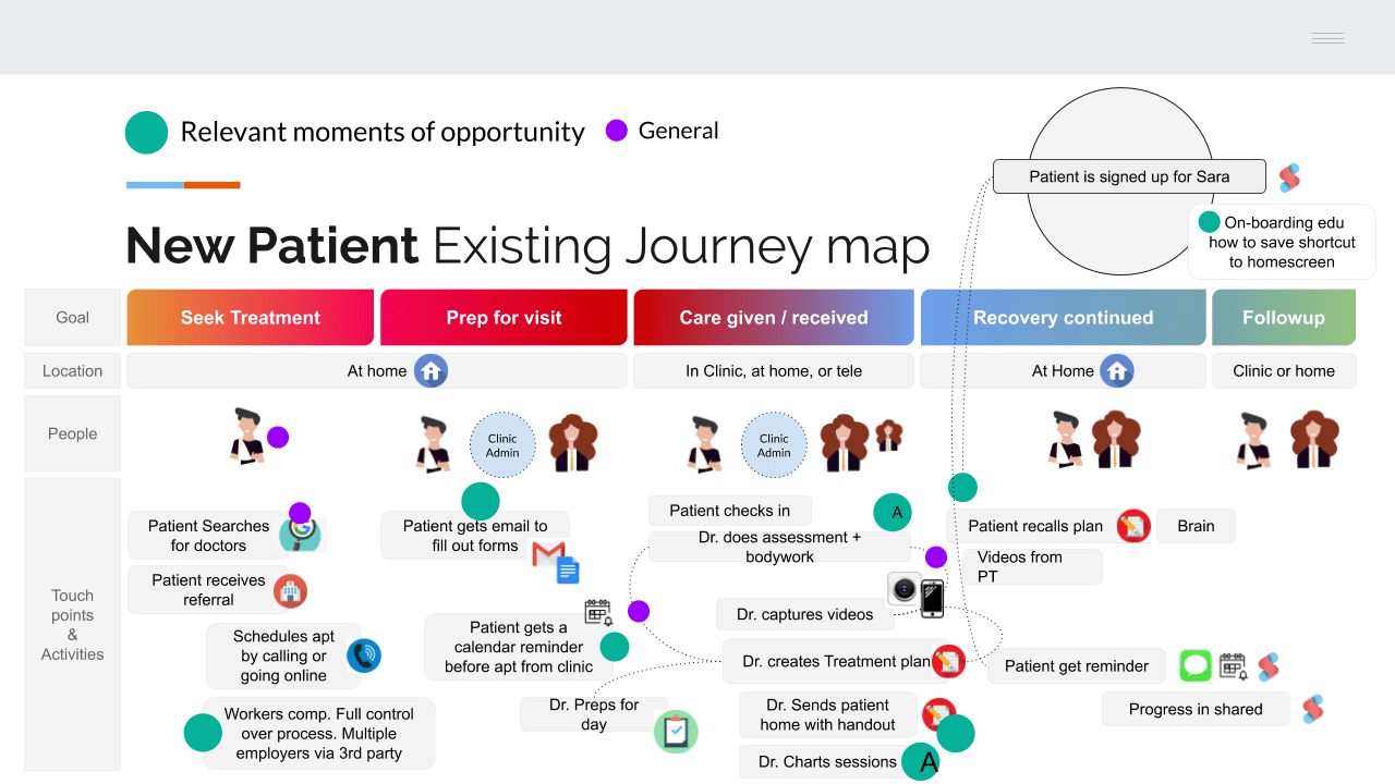
User Journey Workshop
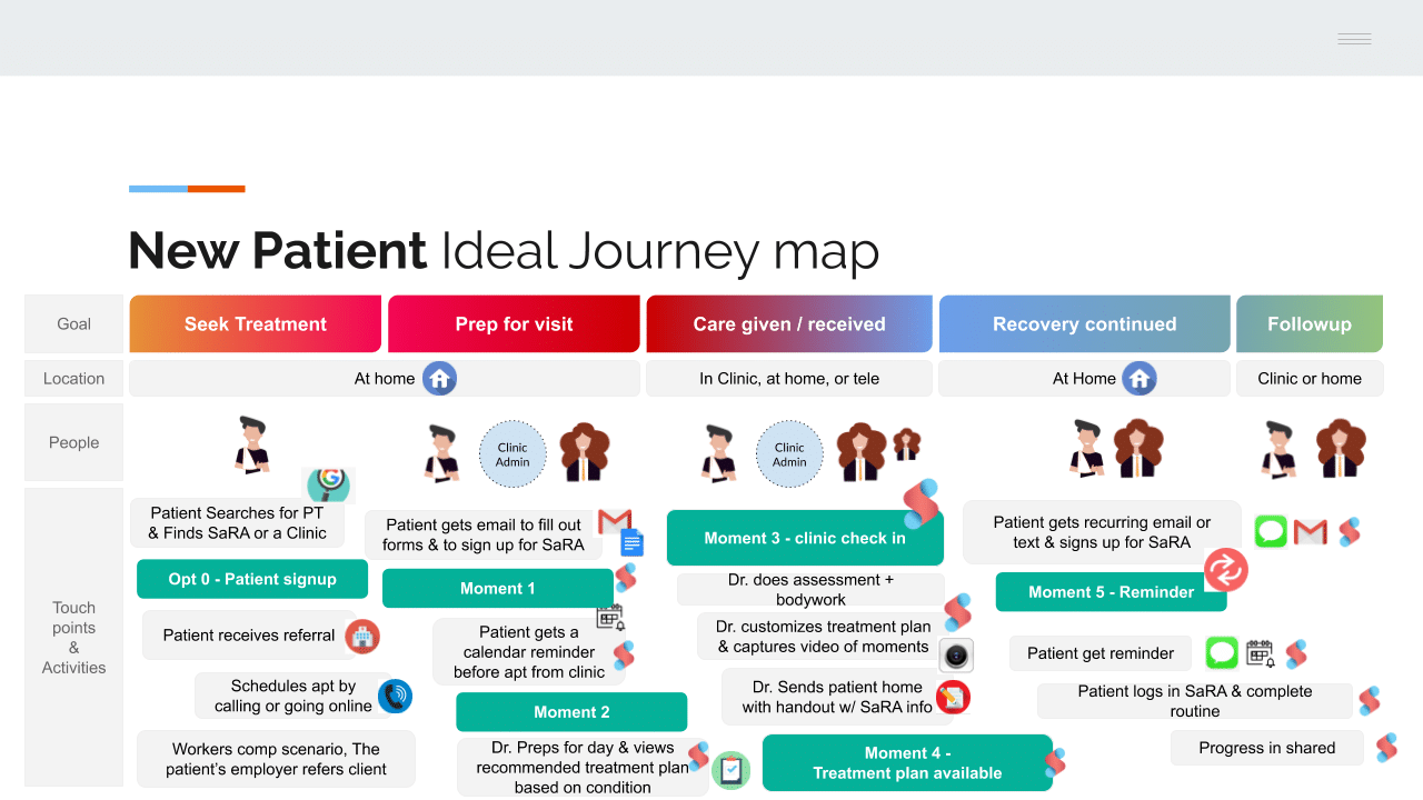
Plotting the end to end first time user experience was a very helpful exercise to expose many key interactions and opportunities between our personas. We started by capturing the existing workflow. Then we created a workflow that represented the ideal UX we wanted to move towards.
02
Planning
After education and consensus about the problem space, it was time to organize opportunity. Since this project leveraged a 1 week design sprint format, it was crucial to hone in on an impactful, meaningful, and realistic scope of work. The following is what we came up with.
Assumptions
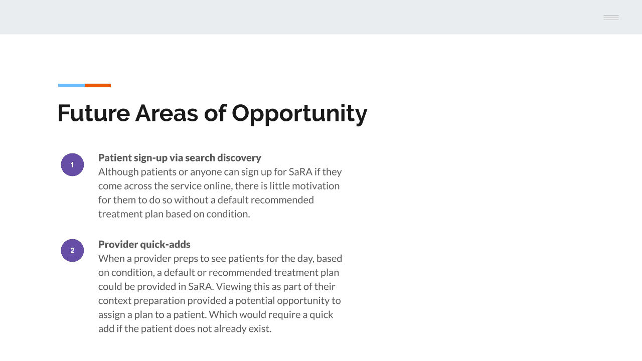
It’s important to note that during the mapping process a key finding on the patient side was awareness and sign-up instructions. This was a dependance for good first time UX.
- The clinic admin supports facilitation of the following moments
- This work will be addressed in another provider focused sprint
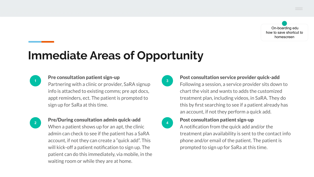
Moment 1: New patient sign up (Pre Apt)
After a patient has found a doctor and gotten an appointment, but before the first visit. In an email along with other pre apt paperwork is a request to sign-up for SaRA
Moment 2: Apt Reminder (Pre Apt)
If the patient, users, misses opt 1, along with an apt reminder, they are reminded to sign up for SaRA before the visit.
Moment 3: Waiting Room (Pre Apt)
If the patient, users, misses opt 1 & 2, when they show up at the office on the day of their appointment, as they check in the office admin reminds them to fill out any missing paperwork including signing up for SaRA.
Moment 4: Clain Treatment Plan (Post Apt)
Regardless of if the patient has already created an account, they are sent a notification when their custom treatment plan is ready to view. Sign-up is a pre-req to viewing.
Moment 5: Clain Treatment Reminder (Post Apt)
This is sent if the patient has not claimed the treatment plan
03
Making
PROTOTYPE
During 1.5 days of prototyping, I came up with the following designs / workflows to address the opportunity. I broke the work up into three sections.
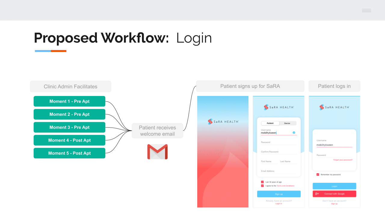
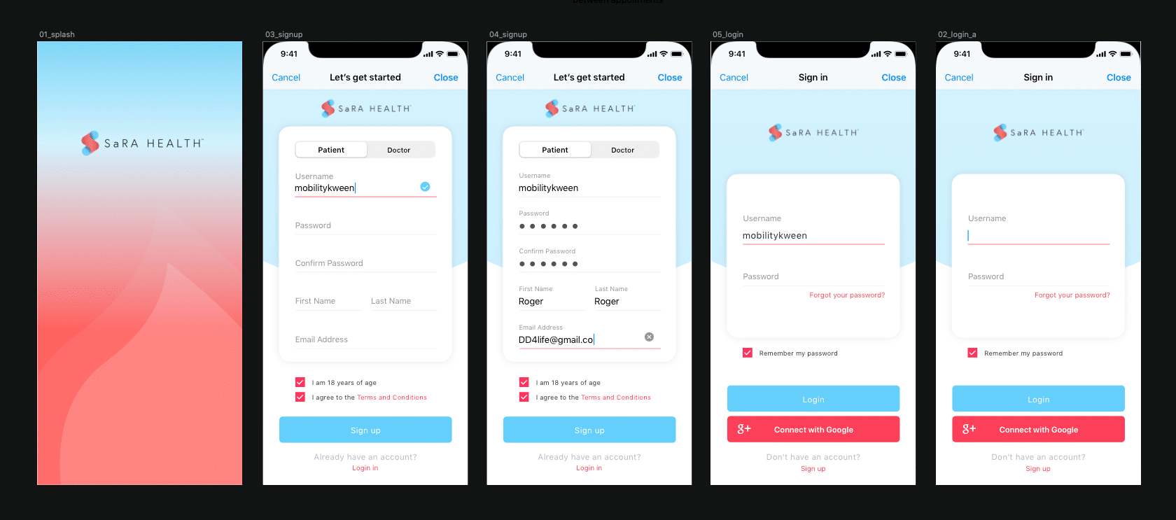
Signup / Login Workflow
As stated above, the most important change in the signup experience was associated with when in the user journey it happens. In addition to adding many targeted moments in the user journey, I also applied the new design system (while I created) to the screens. Emphasis on common patterns and usability.
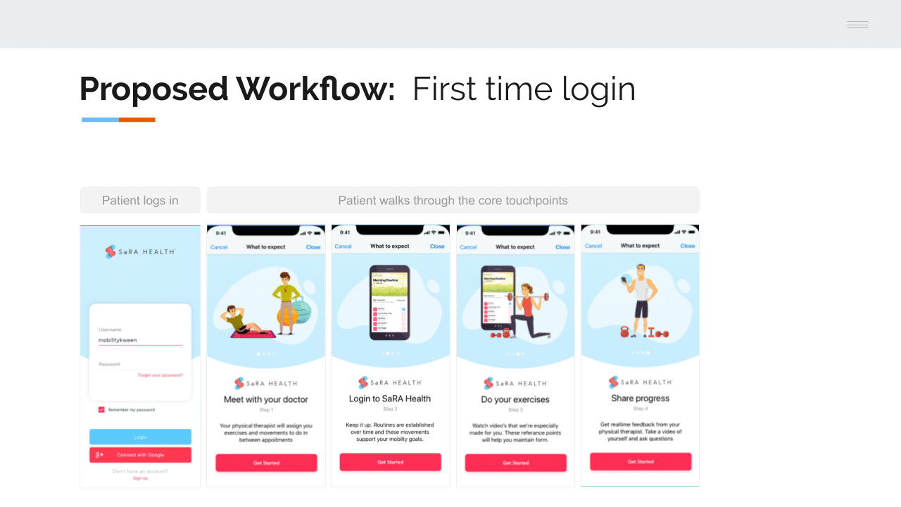
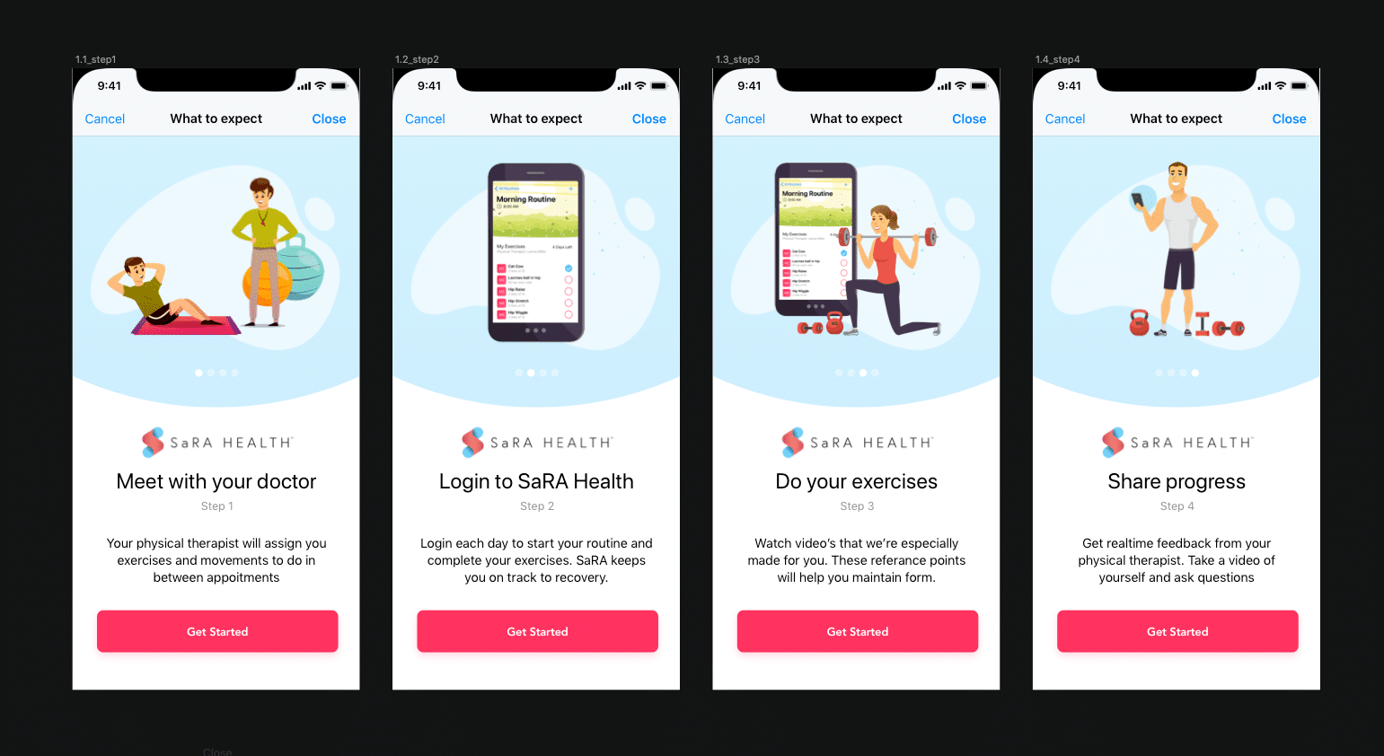
Product Walkthrough
As with most consumer products, in order to be effective the value needs to be immediately apparent in addition to having and intuitive experience. Once simple way to bring awareness to the value of SaRA was to leverage a common pattern, the first time user product walk through. The four points I chose to focus on are below. They are reductive key steps in the overall consumer experience.
- Meet with your doctor
- Log into Sara
- Do your exercises / movements
- Share progress
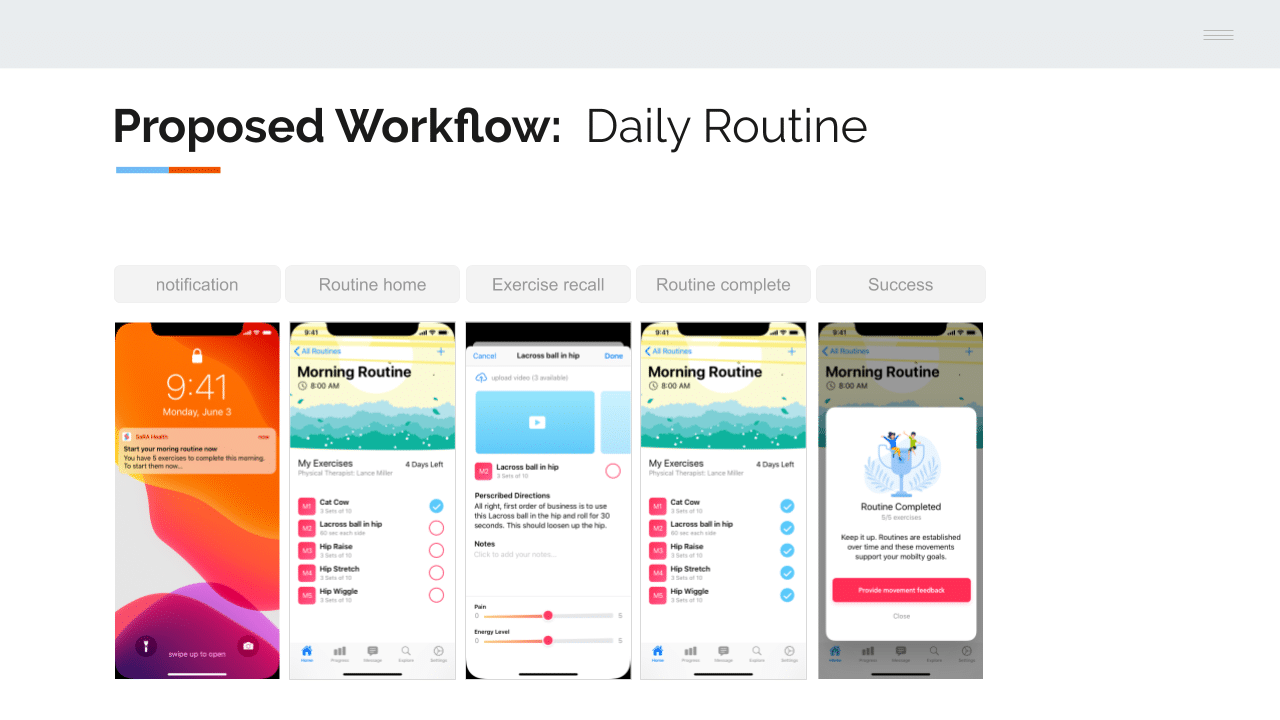
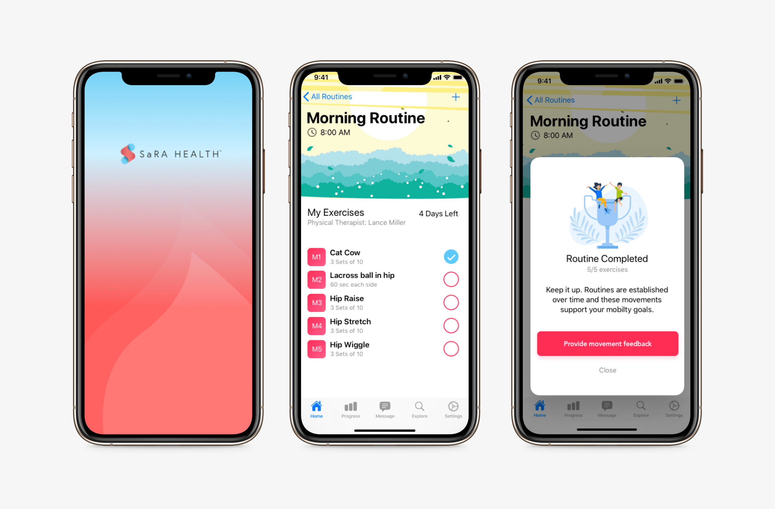
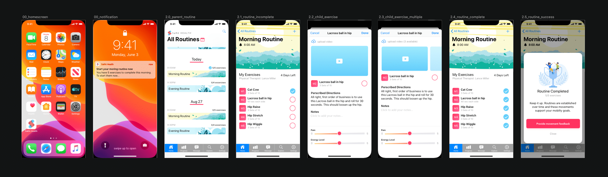
Daily Routine
This workflow was the most demanding from an Information Architecture and Interaction design perspective. The goal was to tease apart the key moments and hide clutter.
Clear action
The goals was to make it dead simple for the patient to record a completed movement
Movement recall progressively disclosed
Assuming the patient is completing the same movements day after day, education is the most helpful on day one. After that the main need from the users perspective is to record movement. This design aims to facilitate easy tracking of movement with the structure of a routine.
Positively reinforce the habit
Adding a simple “routine complete” acknowledgment message was a simple way to positively reinforce the habit within SaRA
04
Testing
Three ways we examined the solution:
- First, I started by getting support from our immediate team
- Second, the SaRA leadership set up a meeting with a provider they were already working with.
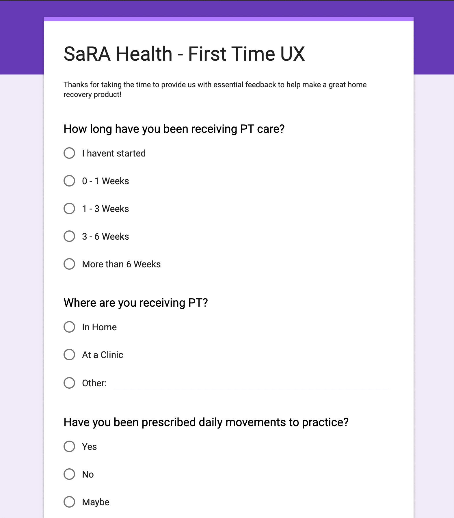
- Third, we created a survey targeting active physical therapy patients, the actual users of the app. The provider partner we met with brokered relationships with their clients so we would have direct access.
Structure of the survey
Participants
This survey was initially sent to a small group of 20 physical patients currently going through an outpatient care program. Although the sample size was not statistically significant, we got good qualitative information.
Questions
- Screener questions
The first part of the survey was dedicated to background info collection. - Intent:
If a clinic admin sent instructions to sign up for an app to track outpatient care would you sign up? - Comprehension:
After reviewing the prototypes do you understand the value of SaRA Health? - Intent:
With a baseline understanding of the service, how likely are you to use SaRA Health to track your daily routines? - Perception:
How easy or hard is it to track your moments with SaRA? (using the prototypes)
Perception:
How easy or hard is it to track review movement instructions with SaRA? (using the prototypes)
Outcome
The learning from the research indicated positive reception to the proposed design and workflow solutions. As the team reflected on the design sprint, one large challenge the company and product strategy still faces is the reliance on provider partnership to promote the solution. As of fall 2020 the team is still working on implementing the recommended solutions, prioritizing their web app experience. After this work was complete we the team engaged me in another design sprint to tackle the provider portal, leveraging our learnings from this sprint.
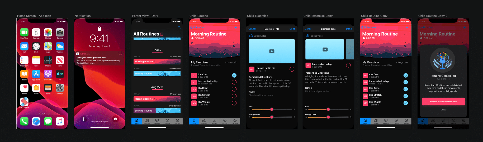
What We Delivered
Here is a look at some of the final designs that were delivered
In Retrospective
Learning 1:
Remote design thinking workshops
This project was conducted entirely remotely across two time zones. Using Google slides proved key in the creation of shared design artifacts that required heavy collaboration such as the user journeys.
Learning 2:
Important dependencies
As called out in the body of this case study, the user sign up must be managed by provider partners. Until a solution is rolled out supporting that workflow, it is likely that patients will likely continue to lack awareness of product.
Learning 3:
Types of patients
Patients receive physical therapy for a wide variety of reasons. For the sake of this project we treated the patient group as homogenous. It is recommended that for follow up projects, further examination and organization be done